Latest News, Clients & Design Projects
The variety of work that comes our way is astounding and guarantees that it's never dull around here...
Logo design, website, various flyers and stationery
Door 2 Door Solutions offers handyman services for all the cleaning, repair and maintenance projects around your home or office you just don't have the time or staff to take care of. Along with the design work we also helped to mentor this new business to get them off on the right foot for their new company.

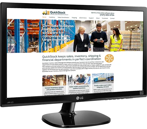
Website design, development and writing for QuickStock Software of Dunedin, FL

QuickStock Software has developed an amazing inventory, sales and management application designed for companies with large inventories. It coordinates all departments from sales, warehouse and shipping so that all orders are tracked and inventory is automatically updated with each sale. We've developed the entire marketing campaign for the company and launched the site in mid March 2021. We're very proud to have worked with QuickStock on their rollout. The new site can be seen at QuickStock.us.
New logo design for Blue Cardinal Real Estate Photography and Videography
Veteran Billy Joe Black had us recently design a new logo for his company that provides still photography of exteriors and interiors of homes and businesses. He's also a very capable drone pilot and can provide areal flyovers and fly-throughs, which can uniquely show off properties for real estate agents. The drawing of the cardinal is based on a photograph of a red cardinal, then colored in various shades of blue to match the name.

Branding design for Maids of All Trades of Florida

Maids of All Trades offers cleaning and meal services, errand running, laundry, pet transportation to the vet and grooming, and many other services designed to assist busy people. We also designed the MaidsOfAllTrades.com website for the company.
Logo design for QuickStock Inventory, Sales and Management Software

John Henderson is the owner and chief programmer of the QuickStock corporation. The software is the culmination of over 30 years of programming and assists companies who have warehouses and large inventories of products. This can include vehicle and machine parts, hardware, building materials, nuts & bolts & washers, and even perishable goods like cut flowers. We're currently working on designing the QuickStock website.

Logo and website for Sweet Pea Specialty Flower Farm of New Hampshire

Sweet Pea is owned and run by Alison Craig and Gary Thorp. Their goal is to build and operate a flower farm growing sweet peas, sunflowers, hydrangeas, peonies, dahlias and tulips for the cut flower market. You cn see their website at www.SweetPeaFlowerFarm.com
New logo design for a distributor of shipping products in Riverview, Florida

Pango Sales, Inc. sells all the products and equipment required to wrap or bind boxes together on shipping pallets so that they arrive at their destinations intact. They sell plastic stretch film, metal and polyester strapping, binding wire and all the equipment needed to wrap and strap boxes together. The challenge was to create a logo that instantly demonstrated what they do in a fraction of a second. The icon and lettering style were created from scratch, and the new brand will be in use shortly in a new brochure we're designing for them.

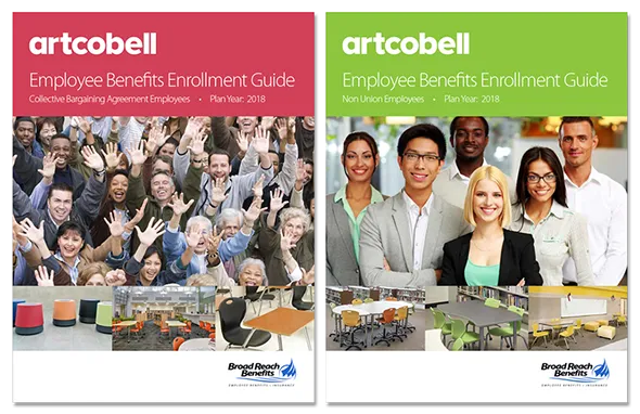
Employee Benefits Guides designed for Artcobell employees

Artcobell designs and manufactures colorful and durable desks, tables, chairs and stools for schools. They needed two 16-page Employee Benefits Enrollment Guide brochure that contain all the health, vision and dental benefits that they offer to their employees (through Broad Reach Benefits of New Jersey). We received the basic text from the client and then built the colorful brochures around it. They were supplied to the client in both low and high-resolution PDF files so they could be sent out via email or professionally printed.
New logo design for an investment firm in Clearwater, Florida
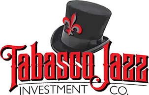
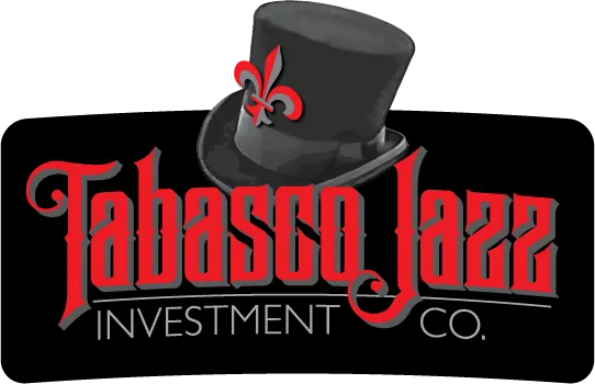
The owners of Tabasco Jazz Investment Co. work with various restaurant franchises, sports celebrities and other notable investors to create new businesses in and around Florida. The challenge for the new company was to come up with a black and red logo that had the look and feel of New Orleans and some kind of Voodoo (African and Haitian-based spiritual folkways) elements which are commonly known in the New Orleans area. After thorough research on the city, its traditions and artwork, we drew the lettering style for Tabasco Jazz in a style reminiscent of signage and posters used in decades past. The "hat" belongs to Baron Samedi (Baron Saturday, a Voodoo spiritual entity that assists the dead to cross over into the underworld). The Baron is known for his flamboyant clothing, his top hat, cigar and his fondness for rum. Two versions of the logo were created to allow the client to use in different circumstances.

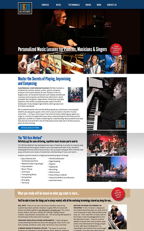
New corporate image, logo, website and book covers for a Los Angeles jazz musician

Bill Keis is an amazing jazz/contemporary keyboardist in the Los Angeles area. He's also a composer, arranger, instructor and the author of "The Complete Guide to Learning Music" and a series of 10 eBooks available on Amazon.com. We are in the process of marketing Bill's various services with a series of websites all directed to the correct audiences that relate to those services.

New logos and website designs for home care nursing company

Inspired Living Home Care is a company in Largo, Florida that provides home nursing care for seniors that allows them to live in their own homes. The Leona Group Home is a live-in care establishment for boys aged 6-16 with physical and/or mental disabilities.

Logo and branding for Incubis Venture Capital

The challenge with this project was to create new logo and icon with Greek/Roman overtones for a new financial services company. The idea was to create a coin-like symbol with the double-headed Roman god (Janus) who is the god of beginnings and endings, doorways and gates, and peace and war. A new drawing style was created to give the heads an engraved look. Studies were done of various ancient and modern coins to understand how light reflects from metal to create a believable "silver" look using only black ink. Our next project will be the company's website, business cards, stationery and various printed collateral.


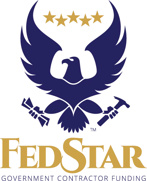
New corporate image/branding for FedStar Funding of Florida

FedStar provides funding for contractors with U.S. Government contracts. Each contractor must put up a security bond in case of non-delivery, which can seriously affect the cash flows of small companies. FedStar offers funding for these companies so they can complete with much larger firms for lucrative government contracts. FedStar challenged us to come up with a logo design that had looked like it had some kind of connection to the U.S. government, so of course the eagle (used frequently in government department seals and logos) had to be used. We created an updated, yet conservative new treatment to the time-honored symbol, with some modern enhancements to make the design memorable and unique. The FedStar executives loved it and then had us build the company's website, which should be launching shortly.
Silver Fin Capital rebranding, logo design, website, printed materials, magazine ads

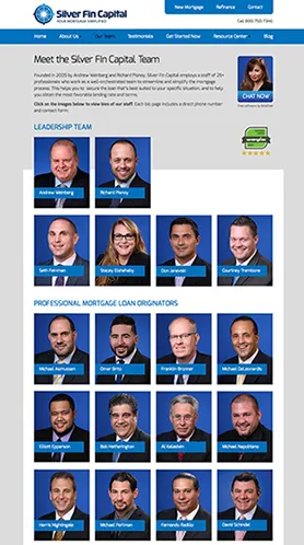
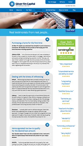
Silver Fin Capital Group of Great Neck, NY is one of the top mortgage companies
in the U.S. with an unheard of 99% customer satisfaction rating by LendingTree. We were asked to create a completely new branding to encompass all of SFC's web, print and advertising campaigns. With marketing strategy and copywriting developed and provided by Gil Effron at ProfitAbility Institute, Inc., we created the new logo above, followed by a website, brochure, stationery and cards, a series of magazine ads and a presentation folder for documents followed, with more to come in the future.

Compliance Auditing branding /logo design
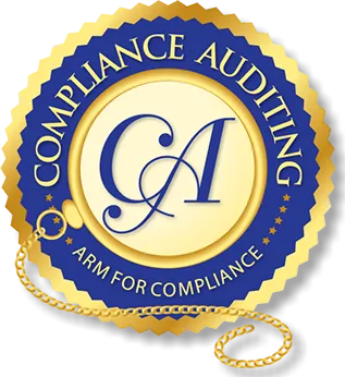
Of all the things we do for our clients, creating professional logos to establish a recognizable branding for their companies, products and services is our all time favorite. Compliance Auditing LLC is a company that helps financial service companies to be in compliance with new federal and state laws concerning consumer privacy and treatment. It checks through all written, web and email promotions and practices to ensure financial firms are in compliance to avoid any fines or potential lawsuits. The client wanted the logo to contain two elements: A "seal of approval" look, and a "monocle", the old fashioned single lens eyepiece of a century ago used before glasses became affordable and commonplace. It was a challenge — and the client LOVED IT. The logo will be used on the company's website, business cards and all their printed and PDF materials. It is a unique branding that helps to make the company instantly recognizable and memorable.

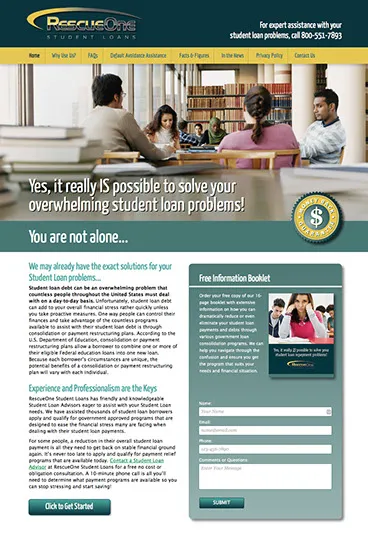
RescueOne Student Loan website and brochure design
This project is part of our continuing affiliate program for student loan remediation companies. The projects include a website design and a 16-page brochure for each new affiliate company. In this case, the client supplied the logo (although we've designed several affiliates with new logo designs). Students across the U.S. are saddled with huge educational debts of $30,000 to $100,000 and more, and it can be a huge problem for many to repay them, especially with the economy in a downturn. These student loan affiliates help by providing assistance to students by consolidating student loan payments through various government programs.


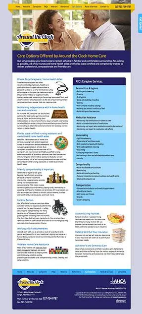
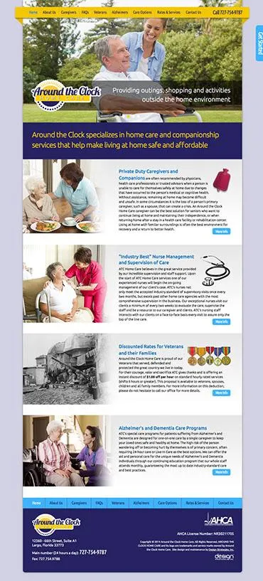
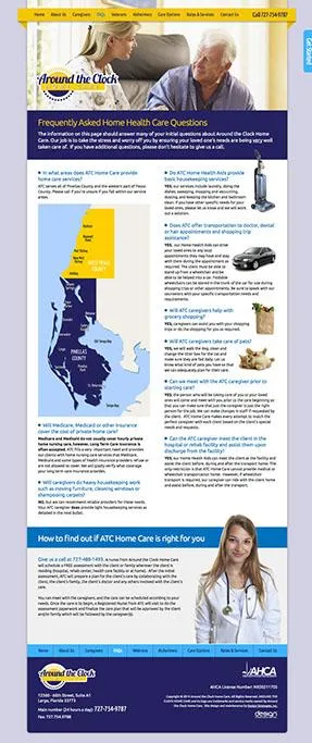
Around the Clock Private Home Care branding, logo, website, brochure and flyers
Around the Clock (ATC) provides private health care, companionship and home services for seniors and invalids in Pinellas and West Pasco Counties in Florida. We created a full corporate image that delivered a solid, professional branding for the new company. We also created 3D signage for the company's offices of the new logo design. The branding was continued across the whole campaign, including a mailable brochure, website, four service flyers, business cards and stationery.

Student Loan Servicing Center logo, brochure and website

Tens of thousands of students in the U.S. finish their education in financial difficulties due to student loans. The Student Loan Servicing Center specializes in student loan remediation services to help these students reduce or eliminate their debts through government consolidation loan programs. We were hired to create the corporate identity, website and brochure. The website has been such a success that the company is currently flooded with information requests.
Logo & corporate image for PetroLife Energy

PetroLife is a newly launched oil company that uses enhanced oil recovery methods to bring aging oil fields back to life, and significantly increases barrels of oil per day on already productive fields. We were commissioned to create a company branding to be used on all their documentation, signage, equipment and vehicles. They love the new design and are currently implementing it into the company's materials. We'll be designing the company's website shortly, along with an avalanche of printed materials. PetroLife executive Kenneth Gerbino stated: "Thanks for the great logo. Everyone just loves it."
Logo design & corporate image for Canadian artist Norma Faye
Norma Faye is an amazing soft sculpture artist in London, Ontario, Canada. Her fabric sculpture projects started out as Christmas stockings for family and turned into a full-blown business. Norma's impeccable designs and choice of gorgeous and luxurious silks, brocades, tassels and various metal and jewel adornments combine to create remarkable decorations and art pieces to grace homes, offices and businesses year 'round. The new logo design showcases one of her beautiful elf stockings and features hand-drawn old-style lettering appropriate for the high quality of artwork Norma produces. Her response to the design: "I received the new logo and it is perfect. The more I look at it the more I like it."
We're now busy designing a new website for the company, followed by a catalog of the sculptures currently available. We're also working on various marketing and promotional campaigns to make Norma's amazing sculptures more widely known across Canada and internationally.

Retractable trade show banners for Titan Oil Recovery of California and Texas

These compact and extremely portable retractable banners work like old-fashioned window blinds and roll down into their own bases for storage and travel. They're inexpensive but don't look it. After the design work is done, printing, hardware and shipping is less than $200 each (depending on height and width). They're only seven and a half pounds apiece and come with their own fabric case with shoulder strap. Give us a call to design one or several for your next presentation, trade show, lecture or board room display. Despite their light weight they'll add several tons of professionalism to anything you say.
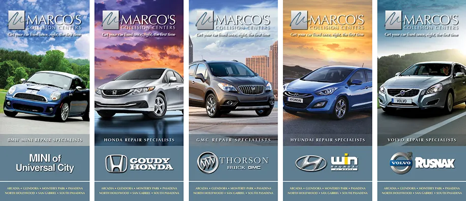
Ten new brochures for Marco's Collision Centers in Southern California
We started working with Marco's back in 1996 when they had only one location in San Gabriel, California. We created the now famous "Get your car fixed once, right, the first time" campaign, which they still use. Marco's has mushroomed into seven full-service repair locations and nine Concierge/Drop Off dealership locations. This series of 10 brochures was completed to co-brand Marco's with 9 different dealerships, who include one of the brochures in the glove box with each new car they sell. If you're wondering where we got all the dramatic vehicle photography—we created most of it with Photoshop. Basic car photos were composited with killer background sky and landscapes to create high impact images that are real show-stoppers.
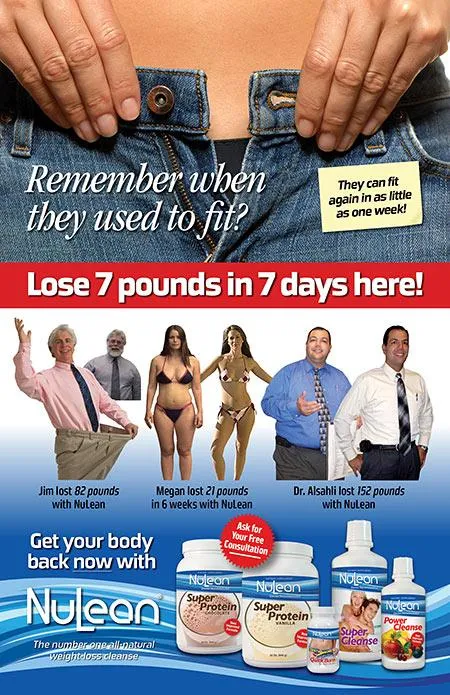
Poster design for NuLean weight loss products
We've been working with NuLean for several years, having designed their logo, product labels and overall corporate image. Recently they needed a desktop size poster for their resellers to use in doctors offices. They sent us a basic mockup, text and some photos and we created the poster shown here. As masters of Photoshop we were able to remove the backgrounds from each of the testimonial photos to highlight the dramatic transformations of 3 different people — and the results are truly astounding! No other retouching was done to the photos, so the weight loss shown is the real thing. All NuLean's products contain herbs, vitamins, minerals and natural food ingredients and are non-pharmaceutical (i.e. no drugs).
NuLean's products work through a method of detoxifying a person's body, which is apparently the real reason many people can't seem to lose weight. Once the toxins are removed, the weight comes off quickly and easily, and because the body is in so much better health the weight tends to stay off even if you "cheat". We're very impressed with NuLean and are happy they've chosen us as their design resource. You can find out more about the company by visiting their website: www.nulean.com.
Free Choice Coupons logo design
This is a new company located in Vancouver, Canada. Their project is currently in development and is hush, hush at this time, but they loved the new logo design. You should be hearing LOTS more from them soon, with a great system for manufacturers, store owners and consumers. It's really quite brilliant.
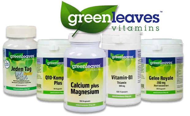
Complete corporate re-imaging for Greenleaves Vitamins in the Netherlands
Greenleaves is located just outside of
Amsterdam in the city of Zaandam (on the Zaan River). They flew us across the Atlantic for a ten-day intensive design consultation and work session where we updated their logo, product labels, magazine ads, price sheets, product info sheets, letterhead, business cards, mailing letters and tons more stuff. The weather was gorgeous and in our offtime we had the chance to bicycle through the streets of Amsterdam — one of Europe's most beautiful cities. If you're ever there, be sure to try the apple tarts with raisins and nuts that they sell in corner cafes and restaurants — they're absolutely delicious with a cup of Dutch coffee.
NOTE TO CLIENTS OUTSIDE FLORIDA:
If you're willing to fly us to your your location, we'd be delighted to work with you in person. Working vacations are right up our street. Of course, we can always work with you via Skype, phone and email.
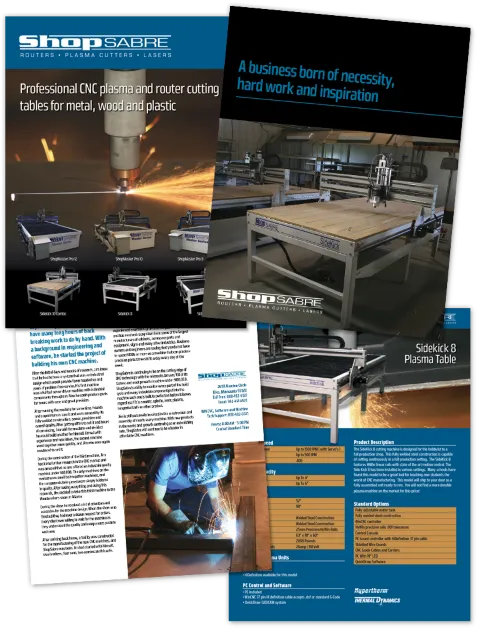
New product catalog design for ShopSabre Plasma Cutters of Minnesota

ShopSabre manufactures professional industrial-grade CNC (computer numerical control) routers, plasma cutters and lasers for cutting and shaping metal, wood and plastic. They challenged us to create a new look for their 12-page plasma cutting table catalog, but needed it completed in less than a week for a tradeshow. As a new client, this involved digitizing their company logo and 2 product logos, as well as creating a brand new identity piece in a style that could be moved out to cover their entire line of products. We received photos and text from the ShopSabre on Friday and completed the catalog by the following Tuesday, just in time to have it printed for the tradeshow. They're now planning on having us design additional catalogs and possibly redesigning their website.
Josh Walton of ShopSabre had this to say:
"You are the man Len!! Thank you for all your help!! You have definitely sold me on customer service. We will be doing a lot more business in the very near future. Thanks again!"
Website design for Pizza del Sardo restaurant vin Valencia, California
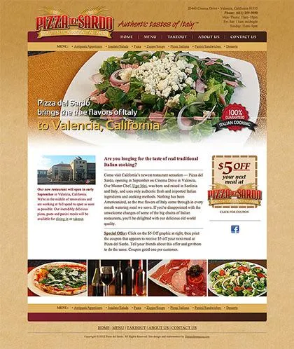
After completing the new restaurant's menu last month, we were commissioned to design and program the company's new website: www.PizzaDelSardo.com
We used many of the food photos that we shot for the menu, creating a web presence for the company to make them stand out with their authentic Italian, non-Americanized cuisine. Part of the marketing for the new restaurant includes a $5 Off coupon for new diners that is available on the website, and will be printed as handouts to give to friends and associates.
Logo and packaging design for organic, high-protein muffins
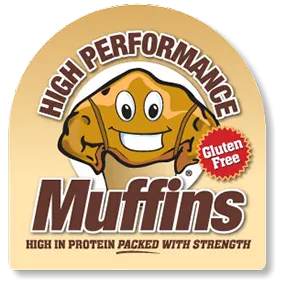
D&D AR Foods commissioned us to update the logo and packaging for their line of gluten-free, non GMO High Performance Muffins. The owners of the company are very fitness and nutrition oriented, and discovered that there were very few products on the market that were actually healthy to eat, even among supposed "health foods" such as granola and protein bars (which often contain tablespoons of refined sugar, protein that's difficult for the body to absorb, potentially harmfull genetically modified ingredients and little nutrition). The new logo and labels attract attention and deliver the message of a healthy snack or light meal for people on the go who care about what they eat.


Corporate image redesign for a tile & stone company in California

Rock Solid Creations, Inc. of Groveland, California has been designing and installing amazing tile and stone kitchens, bathrooms, patios, floors, walls, driveways and more for over ten years. When it came time to upgrade their company image, they called us to create a new logo, website and other marketing materials. The new Rock Solid Creations logo gives an instant impression of high-quality work. The new image sets them apart from other contractors in the same field, giving them increased opportunities for new business leads. One of the first projects after the logo design was to create highly recognizable t-shirts for all their installers. They definitely stand out on the job, and create inquiries all by themselves.

Logo, promotional materials and website design for RRace of Clearwater, FL
Randy Reese Aquatic Conditioning Equipment is a new company that has developed fitness, training and physical rehab equipment made of durable PVC plastic that is impervious to the damaging effects of salt and chlorinated fresh water. This means it can be used in a pool or outdoors with no corrosion due to the elements, as there are no metal parts that can corrode. We were approached to create a professional image and website for the company .

Logo, menu and new corporate image for a new chain of Italian restaurants in California
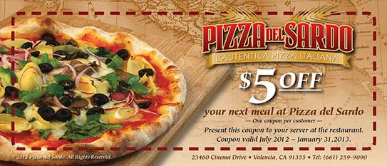
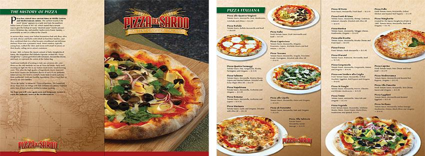
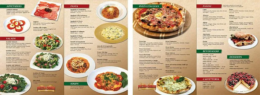
"Pizza del Sardo" is Italian for Sardinian Pizza. The new California restaurant chain uses recipes and ingredients true to real Italian cooking, with its own master chef direct from Sardinia, a self-governing Mediterranean island that is part of Italy. We were challenged to design a new logo, an 8-page menu and other promotional materials for the restaurant to help promote the authentic nature of the food they serve. We did an extensive photo shoot of the food, and then enjoyed eating the leftovers.
Corporate re-imaging project for Vermost Insurance Agency of Largo, Florida
Vermost & Associates Insurance Agency hired us to give them a complete corporate makeover, including a new logo, business cards, stationery, website, newsletter, brochures, magazine ads and various postcards and mailing materials. The new logo has a very simple and memorable look, making the company's mailings and image easily identifiable in a sea of other insurance agencies. The shield was selected as the company's icon with its connotations of protection and service. Vermost's major selling point is their highly personalized service in an age when other agencies are automating and eliminating the human element. We designed the bold Vermost lettering from scratch to give the company a one-of-a-kind look with plenty of authority.

Call us at 727-466-6888 for your next design project
We'd be delighted to speak with you about your design and marketing needs. We have over 28 years of success, working with hundreds of clients around the world to improve their sales leads and income — and we'd love to do the same for you.
Contact Design Strategies for more information on how we can help your company increase its sales leads and income: 727-466-6888
Running a company in today's economy can be hard work. Let us help make your job easier by providing design, marketing and branding services for your website and printed materials. We've helped companies across the U.S., Canada, the UK, Europe, South Africa, and Australia to greatly expand their sales and customers. Give us a call or fill out this form and a representative will be in touch with you shortly.
Contact us to discuss your next marketing project:
International Branding and Marketing Specialists
1130 Cleveland St. Suite 284 Clearwater, FL 33755
© 2026 Design Strategies Inc - All rights reserved. Privacy Policy | Terms of Service
