Your website should be driving in LOTS of new business. If it isn't, call us to develop a new marketing approach...
We've been building professional business websites since 1996 — powerful and effective sites that are clean, easy to navigate and highly informative. We can create a custom website that best shows off your company's unique products, services and capabilities in a way that communicates to your customers and creates sales.
Potential new customers should IMMEDIATELY be impressed with how professional your company looks. The design of the site alone should let them KNOW INSTANTLY that your company is trustworthy, stable and capable. If that's not the impression when they first look at your site—you're losing a HUGE portion of your potential sales. The point is, you should never try to get by with a cheap-looking site as a way to "save money". A properly designed site will make you far more money than it costs. Your sales depend on how effective your site is in getting your message across and getting people to call.
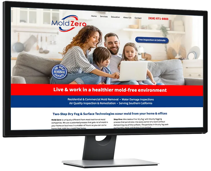
New home page for Mold Zero of California
Mold Zero LLC (mold remediation company) has been a client since 2019.
We've created a range of promotional campaigns that have positively increased their sales leads and income.
Our latest work for them is a complete redesign of their existing site's home page to incorporate successful elements from our other email and print campaigns.
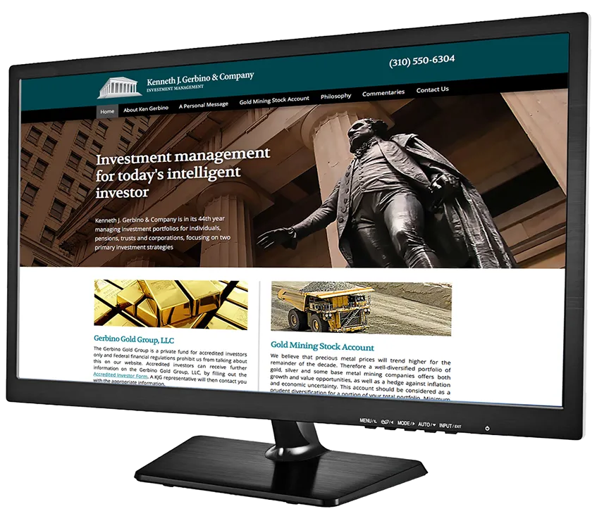
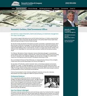
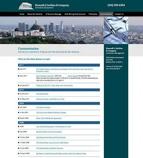
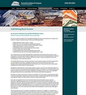
KenGerbino.com website redesign and modernization
We've been working with the Kenneth J. Gerbino & Company of Beverly Hills, CA (financial management firm) since 1995. In 1996, the Gerbino site was our very first commercial website project. Over the years it's had various updates and additions. In 2018 we were asked to make significant text edits to be in compliance with current legal guidelines—and we suggested a major design overhaul at the same time. The previous version of the site was 11 years old and was showing its age. You can see the brand new site at www.KenGerbino.com. We're proud to work with Gerbino & Co. to help promote their excellent services through these many years, and we wish them lots of success in their ongoing endeavors.
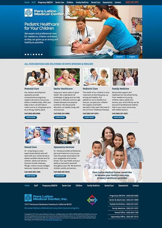
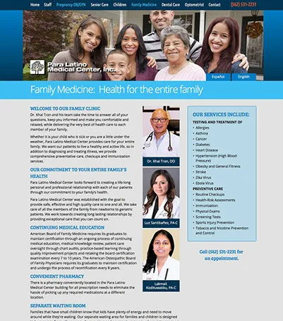
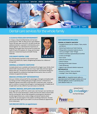
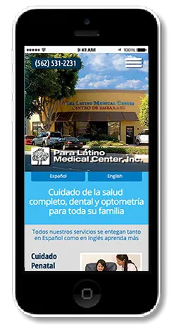
English/Spanish website for Para Latino Medical Center
in Paramount, California
This project was an interesting challenge, as it required interviewing the staff of the medical center, writing the text and designing the site in both Spanish and English. As always, we created the entire site from scratch. We never use pre-designed templates so that our clients get a completely unique and custom user experience. The site is actually made up of 2 separate sites: one in English and one in Spanish. There are buttons on each page that allow viewers to instantly switch between the two sites. Since Paramount has a large Hispanic population, we made the Spanish version the default for
www.paralatino.com. Custom photos of the doctors, physician assistants and support staff at work. The client LOVES the new site and intends to have us add at least one new page about their Youth Drug Education Program outreach into the local community.
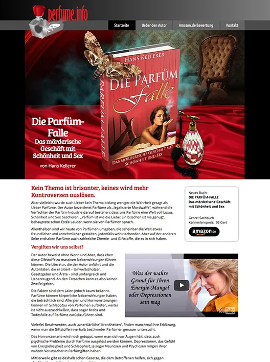
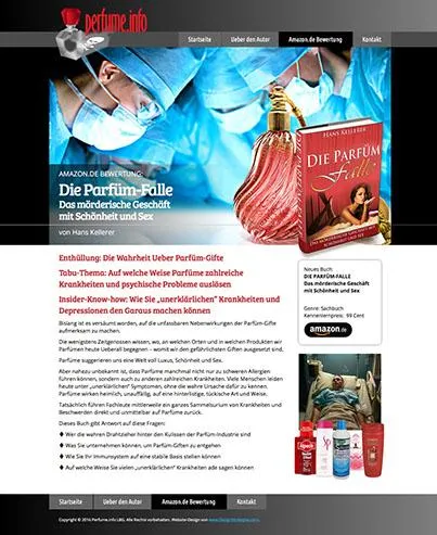
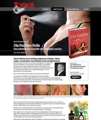
Creating a new website to market a German author's new book
We had designed the Perfume.info logo design about 2 years ago prior to the publication of Hans Kellerer's new book "The Perfume Trap: The Deadly Business of Beauty & Sex". The book was recently released on Amazon in Germany, and we were asked to design a website promoting the book with links to the Amazon.de book page.
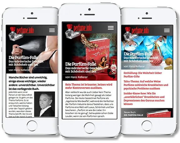
The project was an interesting challenge, as none of our staff speak German. To solve the problem, we simply ran the provided text through Google Translate to get a (very bad) English translation that was good enough to let us know what we were designing. Once the site was designed in English, we simply replaced the text in the original German that the client had sent us, and properly formatted it to fit the layout. It turned out to be rather easy, and the client was delighted with the project. You can see the actual live site at
www.perfume.info.
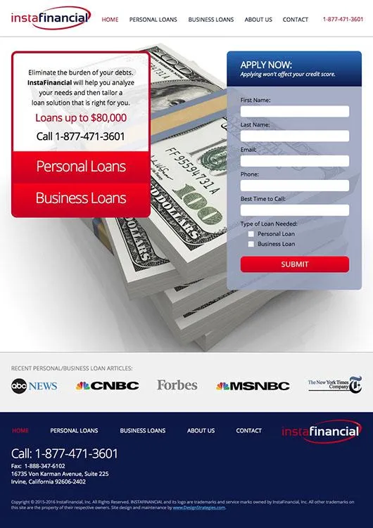
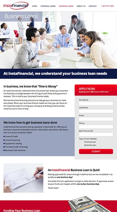

New corporate image and website for InstaFinancial LLC
InstaFinancial provides personal and business loans of up to $80,0000 with fast approvals. We were challenged to come up with a professional website in less than a week, and were able to deliver as requested. Unlike the millions of all-look-the-same Wordpress sites that populate the Internet, Design Strategies creates each website from scratch for our clients. Templates are NEVER used. Each site is built solely and exclusively for each client depending on their needs and their customer base. Give us a call and we'll create a web identity that will make your company stand out from the crowd of look-alikes.


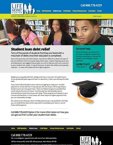

Redesign and re-imaging for the Life Money Center in New Mexico
The Life Money Center delivers services that help individuals and groups to get back in control of their money and raise their financial IQs. There are apparently only 5 methods for digging yourself out of financial disaster, and the Life Money Center representatives are masters at finding the perfect solutions for each individual that fits best with their obligations and ability to pay. They also deliver a series of training courses, entitled the Money Mastery Series, to educate people into how to regain and keep control over their spending and reserves. We created a new logo and overall company image to improve the communication of the successful and valuable services they provide for their customers.


6 essential elements of an effective website:
1. Clean and attractive design that's easy to read, simple and never confusing
2. Easy navigation to find the information you want
3. Photos and illustrations are used appropriately to get your message across
4. Has terrific text content with headlines and subheads that quickly explain the benefits
5. Properly optimized for search engines so it can be found and ranked well
6. Has both desktop and mobile-friendly versions so it displays well on any device
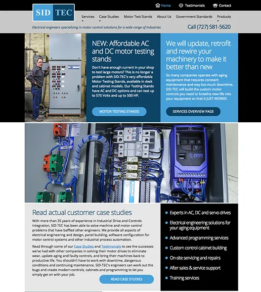
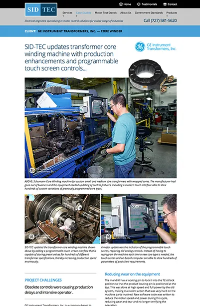
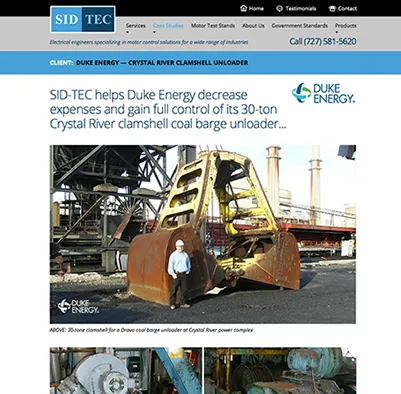

Redesign and remarketing of SID-TEC electrical engineering
SID-TEC is an engineering firm that's so monstrously technical that it was difficult to define and describe what they do so that potential customers could understand the benefits involved. Over a 2-month development period, we worked with the company to translate what they do into understandable English. Through the use of a series of case studies we showed a variety of projects completed by the company, with writeups showing their extreme expertise.
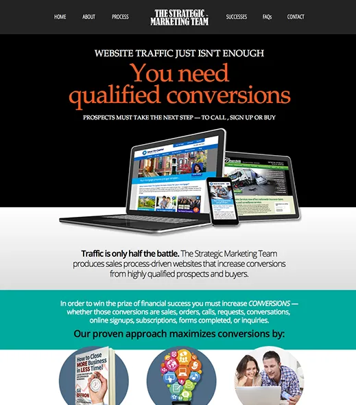
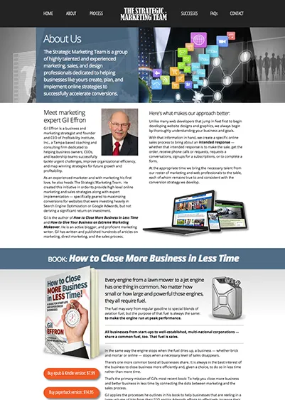
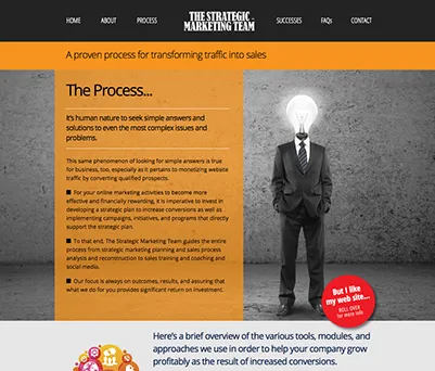
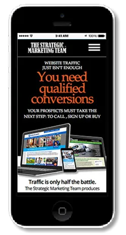
Corporate image and website creation for Strategic Marketing Team
It's not enough to build websites that get lots of traffic — you need to convert
those visitors into contacts and sales. The Strategic Marketing Team does just that. We were pleased to help SMT with the creation of a self-mailer and the desktop and mobile website as shown here. The new site has already been instrumental at helping to close a new client for the company.
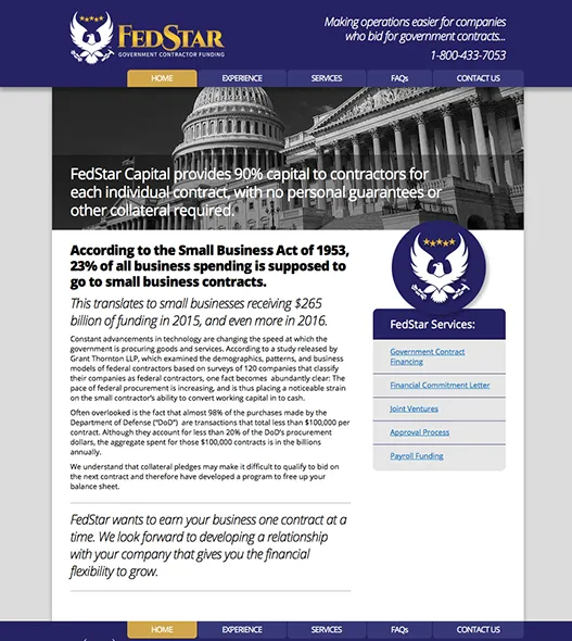
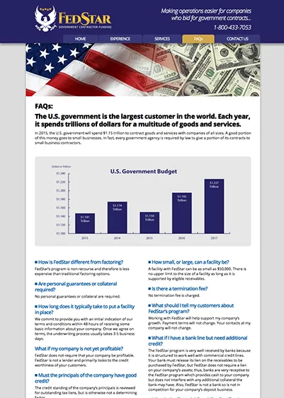
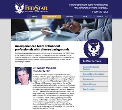
Branding and web site design for FedStar Government Contractor Funding
U.S. Government contacts are given to many companies each year for the supplies and services needed by our federal government. Many small businesses often need financial help to increase their staffing and materials to complete these contracts, which is where FedStar's funding comes in. We were hired to create a new corporate image for the company, the new logo design and a preliminary web site as the company assembles its own investors. We will be creating the mobile version of the site shortly, along with other printed materials outlining the company's services and benefits.
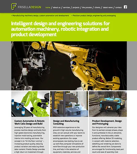
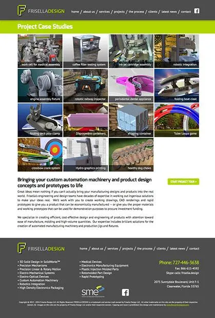
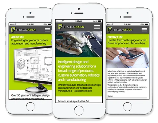
Automation and product engineering firm gains new business and many compliments on its new website
Frisella Design is a professional engineering firm in Clearwater, Florida. They specialize in product engineering of a wide variety of devices and implements, and in automation manufacturing machinery. We completely overhauled their old website from the ground up. We added a Projects section with descriptions to show off the technical skills and problem solving abilities of the company. As a result, Frisella Design has been quite busy because of the increased interest generated by the new site. We recently added a mobile phone-friendly version of the site.
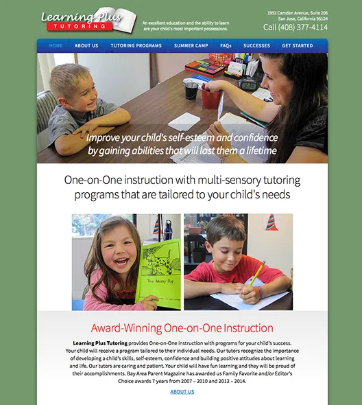
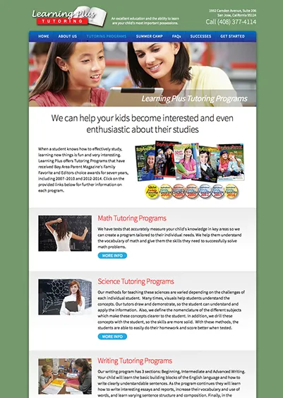
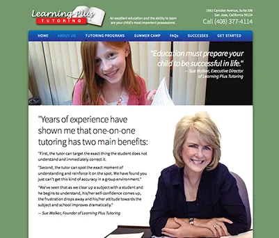
Website design and branding for Learning Plus Tutoring in California
Nothing is more important than empowering our children with the tools they will need to be successful in life. Learning Plus delivers amazing one-on-one tutoring for children and teens in San Jose, California. Their study programs have been awarded top honors each year for over 7 years by Bay Area Parent Magazine, and the many shots of the smiling kids on the pages of the site testify to their successes. The site has helped to significantly increase student signups for their regular math, reading, writing and science tutoring, and for their three Academic Summer Camp Programs.

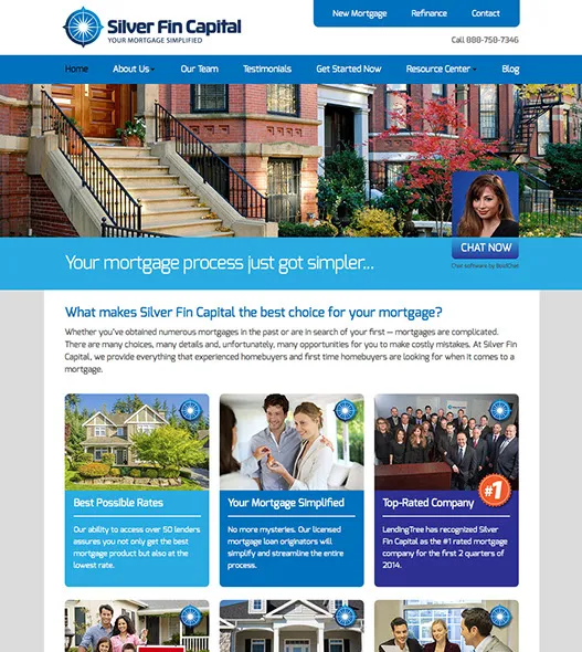
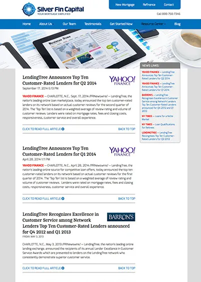
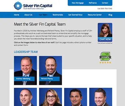
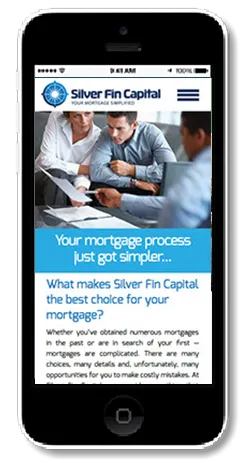
Rebranding and redesign of Silver Fin Capital mortgage company of Great Neck, New York
Silver Fin Capital is a large and successful mortgage company, recognized nationally as one of LendingTree's Top Ten for all 4 quarters of 2014. We were hired to update all their marketing materials from the ground up, including logo design, website, various printed materials, stationery and business cards, and a series of magazine ads. We created all new content, including all the important value propositions that Silver Fin Capital brings to each of its customers. The chief executives are very pleased with the new corporate image, and we expect to continue to help Silver Fin Capital into the future by providing additional materials and marketing.
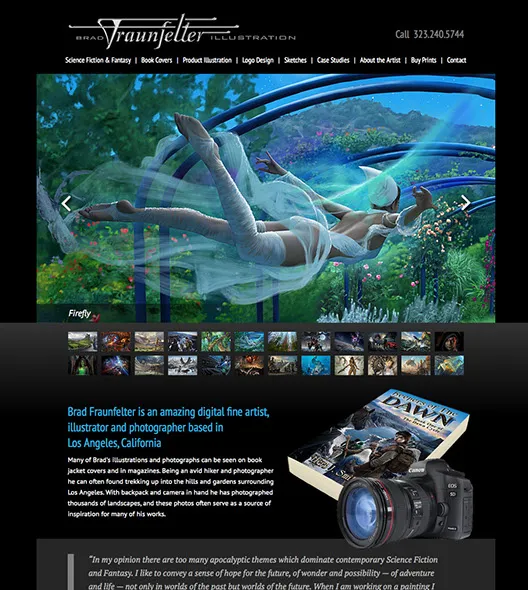
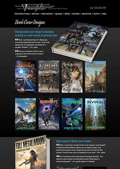
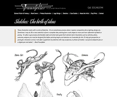
California illustrator Brad Fraunfelter needed a higher impact site to show off his stunning artwork, which wasn't attracting enough attention
Brad is an illustrator, painter, photographer and Photoshop expert who turns out absolutely amazing illustrations for book covers for many authors and publishing companies in California. Brad's work is jaw-droppingly good, however, his old site just wasn't attracting enough attention the way it should have. The new site displays his artwork in LARGE images and has plenty of marketing content throughout the site that lets viewers get to know him and his skills. Almost immediately upon launch, the new site began receiving a lot of attention and created a string of artwork commissions for book covers.
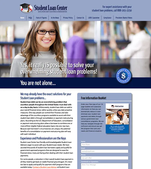
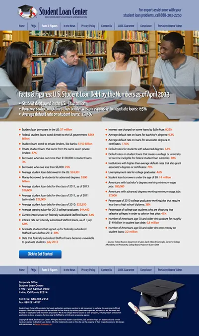
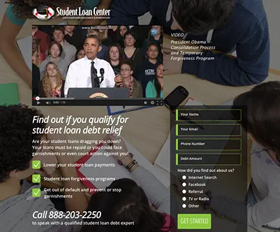
Student loan debts now exceed credit card debts across the U.S. Student Loan Center hired us to create an online presence for their debt remediation assistance services.
Government programs exist to help students pay off their education loans in a reasonable manner. Student Loan Center provides assistance in finding the right program to suit individual needs, and monitors these programs for their clients to ensure policy changes and renewals are current. We've provided additional landing pages and recently a page of videos used in the education and sales process of closing new customers. Our client loves our fast turnaround and responsiveness to their changing marketing needs.


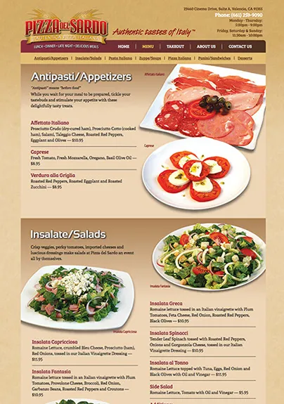
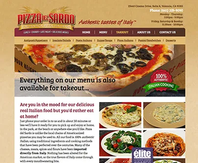
Branding and marketing of a brand new California authentic Italian restaurant
This project is an excellent example of how to start a new restaurant business the right way. We created the entire corporate image from scratch, which involved designing a unique and recognizable logo, website, menus, magazine and newspaper ads, flyers, coupons and more. We photographed all the mouthwatering food shots and created an overall image that makes people start drooling at first sight. The restaurant was awarded Elite Magazine's top honors for best Italian food in the Santa Clarita Valley in 2014. The main positioning for the restaurant was a genuine, un-Americanized authentic Italian recipes and ingredients. The head chefs were both authentic Italians, and brought with them years of experience and professionalism. We managed to communicate this uniqueness to the public, which brought in a lot of business, especially Italians and New Yorkers longing for the true tastes of Italy.
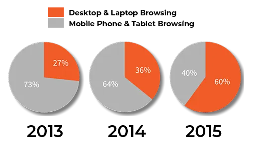
Every year more people surf the Internet on their phones and tablets
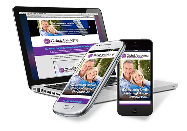
A professional mobile-friendly website will capitalize on mobile visitors
If your site isn't designed to be easily read and viewed on phones and tablets, you can be losing an increasing number of visitors to your site — and this means lost sales. Figures for mobile phone and tablet use for 2014 were around 36% of all web traffic. In 2015 that number amost doubled to around 60%, and is expected to increase each year. We can build you a fully customized site that will display well on ANY device. Call us to plan out an effective mobile strategy for your company's products and services.
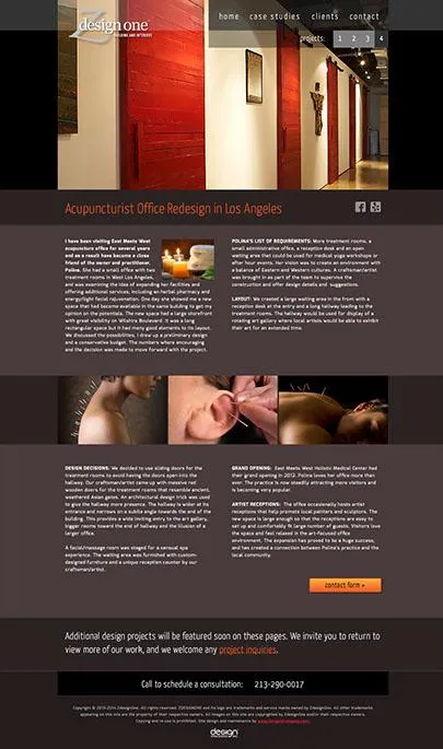
A professional mobile-friendly website will capitalize on mobile visitors
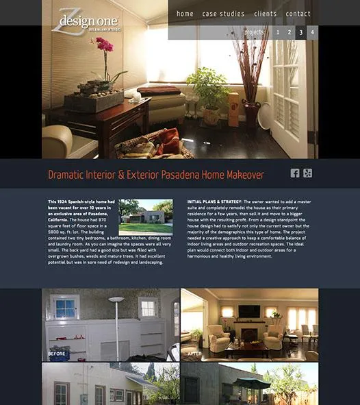
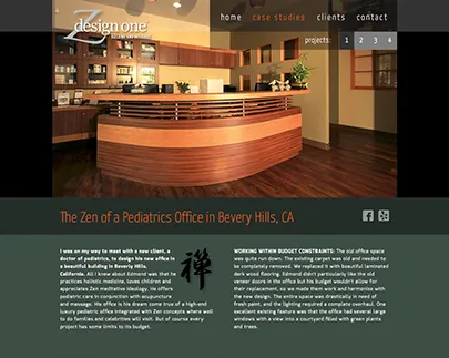
Nooshin Zolghadri hired us to create a website to demonstrate her architectural talents in projects built in and around Los Angeles county. We broke her work down into projects and had her write up each one to explain the designs, the problems encountered and how she solved each of them. The resulting site gives an excellent profile of her work and demonstrates her obvious talents for both residential and commercial architecture. We will be adding to the site as further projects are completed.
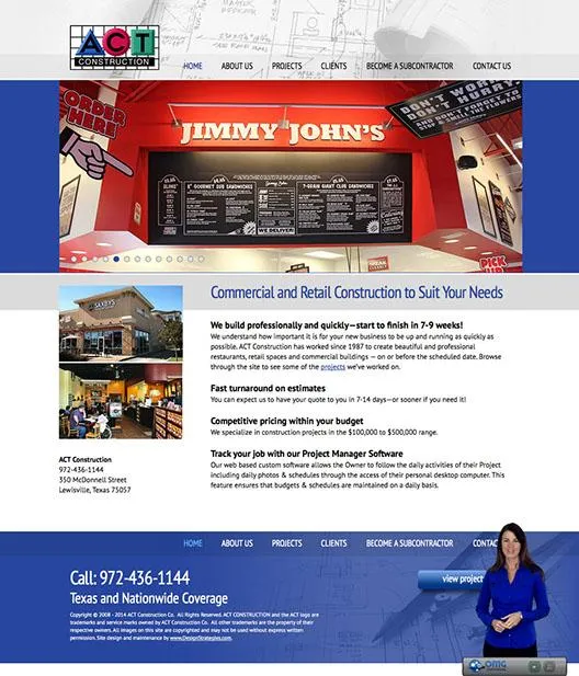

New website helps ACT Construction remain prosperous during the real estate recession
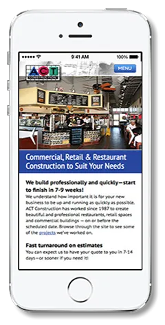
We were contacted by ACT Construction of Lewisville, Texas to create a new website for their general contracting business specializing in retail and restaurant construction. The site helped keep ACT busy during a period when many other contractors were going out of business, and it continues to bring in new work each month since its completion. We recently added a mobile phone version of the site to make it easy to view the site on iPhone, Android and Windows phones. ACT has been delighted with the results.
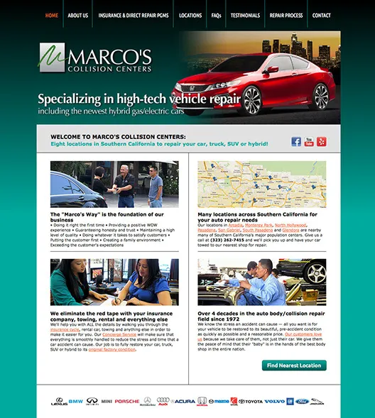
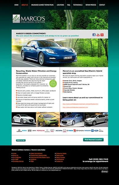
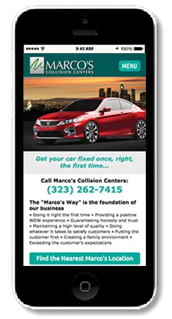
Over 18 years of successful marketing helps Marco's to expand from one location to seven full service shops and nine car dealership offices!
All the way back in 1996 Marco's came to us via a referral from another of our clients. They had one location in San Gabrielle California, and they were having trouble with nasty competitors waging a PR war on them. We devised a campaign that eliminated the false negative PR — and they are still using the same campaign 18 years later! We redesigned their website in 2012 and created a mobile version of the site just last year. It still continues to attract new visitors, who always report that they are very impressed with the site's ease of use (and the great service they receive at Marco's, of course). UPDATE: In 2014, after many years in business, the owners of Marco's decided to retire and sell the company to a national auto repair chain. We have been happy to work with them for so long, and to have helped them retire in very good financial shape due to their excellent services and our successful design, marketing and promotional work.
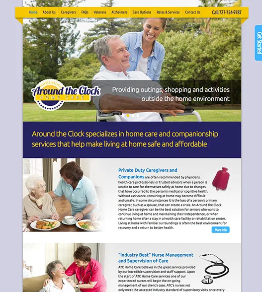
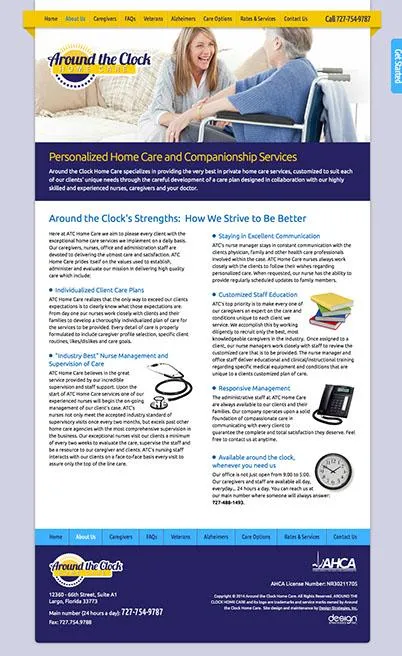
Around the Clock Home Care site delivers a professional message of competence in a highly competitive industry
Florida is the retirement state and is filled with well over a hundred competing home health care companies. In order to establish a name and become visible in such a market, it's necessary to thoroughly work out the exact message(s) your site needs to deliver. Around the Clock's new site is easy to read, beautiful to look at and simple to navigate. Many similar home care sites are a confusing mess of information that tend to drive people away rather than bringing in new sales.
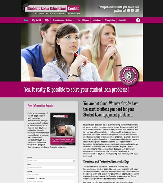
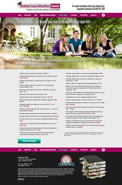
Student Loan Education Center offers bill consolidation help to get out from under crushing debts
Hundreds of thousands of graduates find themselves at the end of their university and college educations with a pile of debts that are difficult to pay back until they get their careers going. This company offers assistance with government remediation programs that help students consolidate their loans and can even eliminate payments in some cases. We also created the company's logo and corporate image.
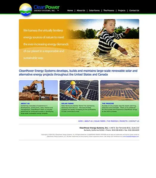
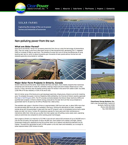
Branding and corporate image for an alternative energy company helps to kickstart its operations in the U.S. and Canada
CleanPower Energy Systems hired us to launch their solar and alternative energy company marketing by designing a logo and unique branding, and creating a website that shows off their capabilities, executives, industry connections and projects. Besides solar power sites, CleanPower will be developing wind, water and biofuel electricity generation installations in their goal of supplying clean, non-polluting electricity to replace coal fired plants. We applaud their much needed environmental efforts.
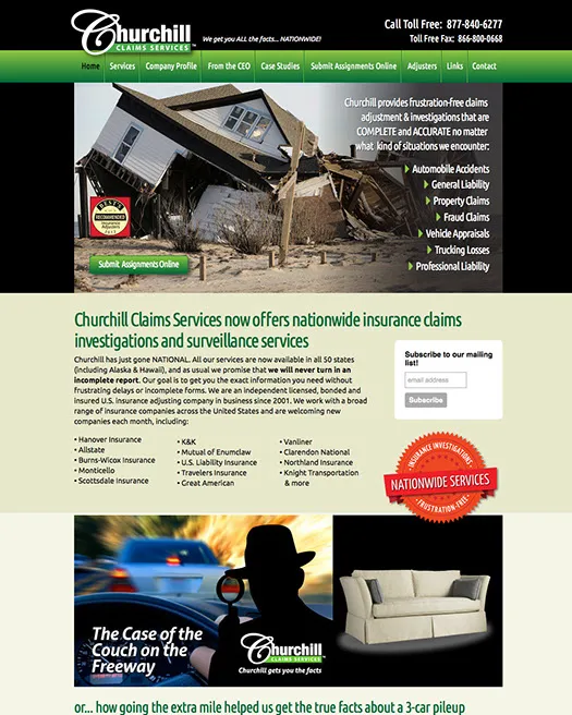
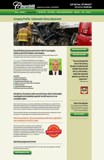
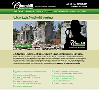
New marketing campaign helps Churchill Claims expand to nationwide services within 4 months
Our new web and email campaign allowed Churchill to solve a potentially disastrous situation and dramatically turn around its sales leads. A series of case studies highlighted Churchill's ability to deliver on their promise of frustration free insurance claims investigations, despite any barriers and difficulties. The result was income and new claim submissions statistics sharply rising for months, allowing them to expand their operations from 7 states to all 50.
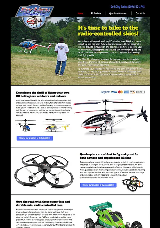
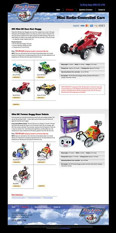

Fly High Helicopter Guy redesign enlivens toy radio-controlled toy site
We all have a bit of a kid inside us, not matter what our age. Fly High Helicopter Guy in California tests and sells only the best quality RC helicopters, quadcopters (4 rotors) and mini race cars. Unfortunately their old site just didn't show off
the toys the way they should, and it relied on phone sales with no way to shop on-site. We gathered information and images for each of the toys and worked out a clean and simple layout with enough information for buyers to select the models and features they were looking for, and purchase directly from the site. A simple direct-to-PayPal shopping cart was set up that allows payment via Visa, Mastercard, AmEx and PayPal Accounts. All transactions occur on PayPal's site for rock solid buyer security. Have fun on the weekend!
Website FAQs:
Is it difficult to work with long distance clients on a website project?
Not at all—we've been doing it daily for clients across the U.S., Canada, Europe, South Africa and Australia since 1996. In fact over 90% of our clients are outside Florida, including many international. Clients usually find us through our website or through a referral from an existing client. They look through our website design samples, then give us a call or email and we begin the project. We have regular phone meetings, and when possible, we use Skype, a free Internet calling program that lets us talk as long as we want at no charge. For those with videocams built into their computers, Skype allows video conferencing that is almost like having them right in our office. See
Skype.com for more details on their free software. It's easy to set up and costs you nothing.
What kind of website services do you offer?
Design Strategies provides professional web design, e-commerce, expert customized backend programming and basic-level SEO (Search Engine Optimization) to help your site rank higher on web searches.
We also offer site hosting services through affiliate companies or we can use your current web hosting company if you prefer. We also offer photography, illustration, logo design and writing services as required.
How much will my website cost?
Websites vary considerably in price depending on the answers to questions such as:
• How many pages will your site have?
• Will you need custom drawings, artwork, photography or stock photos?
• Will you be supplying text and product photography or will you need us to research, write and/or do photography?
• Will your site need custom programming, a web store, an online catalog or database connectivity?
All these things have a considerable impact on the time and work that goes into creating your one-of-a-kind site. A typical small business website can range from $1500 to $3000, while larger, more involved corporate sites can be moderately to majorly expensive and range from $5000 to $8000 and higher for larger sites. We'll work with you to design exactly the site you need to reach your customers, with care and an eye towards your budget—which is especially important in these uncertain financial times.
After discussing your needs on the phone or in person, we will send you a written quote with exact specifications so that you will know exactly what it will cost and what you will get. Everything is up front and in writing so that there is no confusion on what was ordered or what you'll be paying.
Are your websites based on pre-designed templates?
NO! We NEVER use templates or cheesy-looking clip art / images.
We understand that your website is vital to your business, so every site is custom designed to be unique and memorable. Your website will always have a one-of-a-kind look to maximize impact and communication.
How do I know I'll like the design you come up with?
We will work with you until you're completely pleased with the results. We will take the design process one step at a time, with you in control at each step.
After thoroughly discussing the project with you, a basic design sample will be created for a single page. It will show the navigation bar, basic graphics and general layout so that you can see exactly what it will look like. We will then fine tune it to your satisfaction. We only start building the actual website AFTER you're pleased with and have signed off on the basic design concept. So, there are no unwanted surprises. As each page is completed it is posted to a temporary location on our site for your review.
What is the best way to send text and photos to you that will be displayed on the site?
The best way to send text and photos is to put everything into a folder, Zip it, then go to WeTransfer.com and send it to our email address.
If you're unfamiliar with WeTransfer, give us a call and we'll walk you through it (it's very easy to use). We prefer text in Microsoft Word format (Macintosh or Windows). Photos can also be emailed to us (as long as it's just a few images) or burned to a CD or DVD and FedExed. We'd also like to have you send us your current and recent brochures and ads to get information about your company and an idea of how you've been promoting.
What if I need you to photograph products?
FedEx the products to us and we'll do all the custom photography to make them look their best. You can also hire a local photographer and have him or her send us the shots via WeTransfer.com. You can also FedEx or mail them to us on a flash drive or CD/DVD.
OK, so how do we get started on the project?
Give us a call at (727) 466-6888 and we'll discuss your company, your products and services, and what you're looking for.
We'll then send you a complete quote and on approval we'll get started on your site. Alternately you can fill out our online form including info about what you need and we'll call you.
What about financial arrangements?
We require a 50% deposit at the beginning of the project with the balance due at job completion.
For very large web projects we can work out a payment schedule that is divided into 3 or 4 payment periods coinciding with major points of the site development.
We accept Visa, Mastercard, American Express and Discover cards, PayPal and checks made out in U.S. funds.
Do you have other questions that weren't answered here?
Give us a call at (727) 466-6888 or fill in our Contact form.
We'd be happy to have you pick our brains and check us out. We're looking forward to working with you.
Call us for your next website project
A simple call to 727-466-6888 can open up a whole new world of sales leads and increased income by having us design or redesign your website. We'll be thorough, professional and will create a site you'll LOVE to show off — because it will make your company look TERRIFIC.
International Branding and Marketing Specialists
1130 Cleveland St. Suite 284 Clearwater, FL 33755
© 2026 Design Strategies Inc - All rights reserved. Privacy Policy | Terms of Service
